LOGOS


Goal
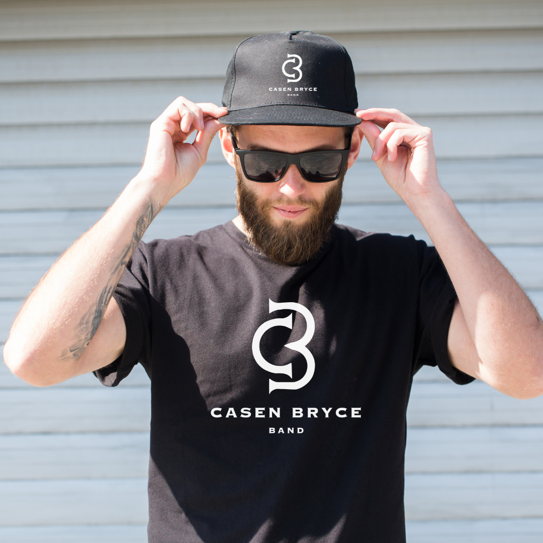
Design a bold, memorable logo for the newly formed Casen Bryce Band that incorporates the artist’s initials and reflects the band’s musical identity. The goal was to creatively blend the initials “C” and “B” with a guitar-inspired element, resulting in a mark that could work across merchandise, social media, and promotional materials.
Approach
The process began with researching logos and visual styles that fit the band. Using Adobe Illustrator, I explored how the initials could be stylized into a monogram that subtly included the shape of a guitar. After several drafts, I created a design where the “B” formed the body of a guitar, and the “C” framed the left side. The combination created a clean, modern look that fit the band’s identity.
Results
The final logo is a simple yet striking emblem that combines Casen Bryce’s initials with the silhouette of the body of an acoustic guitar. It’s versatile and easily scalable for use on merchandise, event flyers, social media profiles, and streaming platforms. The client was highly satisfied, and the design has already helped the band establish a recognizable visual identity as they begin their public journey.
More of my work


